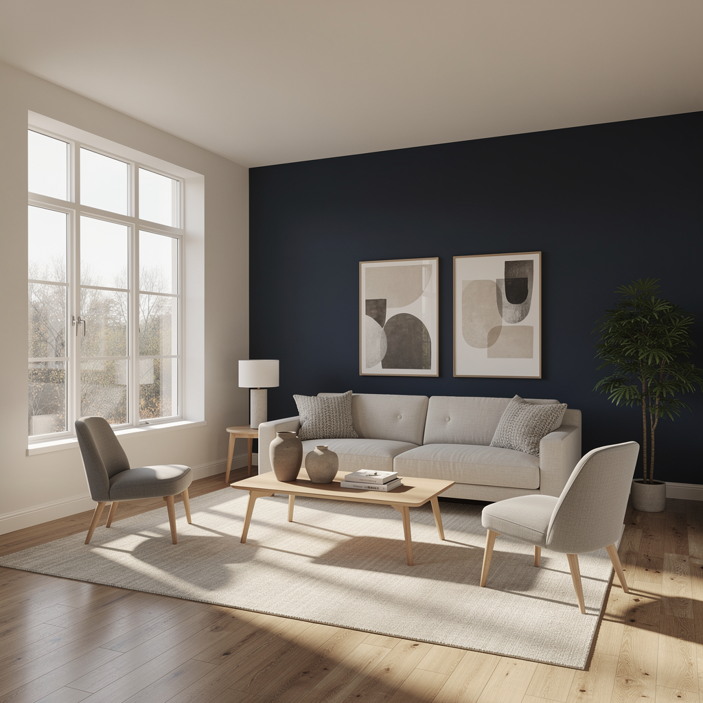
Did you know that the right wall color can literally increase your nightly rate and boost online bookings for your short-term rentals? In the competitive world of vacation rentals, color psychology is a silent salesperson that shapes guest perception before they even walk through the door. Mastering the art of strategic paint choices is a fundamental pillar of effective property management that directly impacts your rental yield.
Why Color Matters in Short-Term Rentals
The visual appeal of your listing in photos is the primary driver of click-through rates. Our analysis shows that properties with strategically chosen paint colors achieve higher click-through and booking rates than those with haphazard color schemes . When guests scroll through endless listings, light, neutral tones create a sense of openness and tranquility, making spaces appear brighter, larger, and cleaner . This is not just about aesthetics; it is about perceived value. Studies in real estate and retail show that white equals more expensive, is perceived as more finished and polished, and this perceived value drives the price guests will pay .
Unlike traditional long-term leasing where landlords might default to plain white, short-term rentals require a more nuanced approach. Plain white walls can appear institutional and sterile, which may deter guests looking for a cozy, home-like experience . The goal is to create a space that feels curated, fresh, and photo-ready. A cohesive color story using varying shades of the same core palette prevents the property from feeling disjointed, reinforcing the unique identity of your hosting brand .
The Power of Neutral Foundations
When deciding on a palette, neutral colors like beige, cream, gray, and off-white are the safest and most versatile options that attract various tastes . These timeless colors complement different furniture styles and decor, creating a sense of openness that is crucial for small spaces or narrow hallways . Light tones reflect natural light, effectively opening up rooms that might otherwise feel cramped.
Among the neutrals, off-white is often the landlord’s preferred choice because it complements many interior styles without being cold . For a more modern yet warm look, consider a warm greige like Benjamin Moore Revere Pewter or an off-white like Sherwin-Williams Alabaster, which are top performers across various markets . These mid-tone neutrals, such as greige or taupe in a satin finish, are ideal for high-traffic areas because they do not show dust like dark colors or scuffs like stark white .
While neutrals are the best option for rental homes, they can sometimes be interpreted as boring if not executed correctly. To avoid this, landlords often choose an eggshell sheen accompanied by satin for high-traffic areas like hallways or kitchens, as these finishes are easy to clean and maintain .
Strategic Accents for Guest Experience
Once you have established a neutral base, you can introduce color to enhance the guest experience. For a sophisticated, calming focal point behind a bed or in a dining area, deep blues like Benjamin Moore “Hale Navy” create a high-end feel . Similarly, Sherwin-Williams “Pewter Green” provides an organic, grounding presence that photographs beautifully and connects indoor spaces with nature .
If you want a bold pop of color without overwhelming the space, consider blue, pink, green, or yellow depending on your style . For a coastal cottage, soft blues and seafoams create an immediate connection to the water . For a dramatic, editorial look, a sophisticated black like Behr “Limousine Leather” can elevate a simple space [3]. However, avoid shade combinations with murky yellows, browns, and greens, which can make a space feel dated . Instead, keep things fresh with clear, mid-tone blues, jade greens, refreshing pastel yellows, and soft, welcoming whites .
Different demographics also respond to different color palettes. Gen Z prefers a wide range of colors including variations of yellow, purple, orange, and pink, especially if the property is in an area with outdoor activities . Gen Xers tend to be drawn to bright, exotic hues like jade greens and deep violets paired with gray or silver neutrals [2]. Understanding your target market allows you to tailor your hosting strategy effectively.
Three Actionable Strategies for Hosts
To implement these color insights effectively, hosts should focus on the following actionable strategies:
- Choose the Right Finish for Maintenance: Use satin or semi-gloss sheens in high-traffic areas like hallways and kitchens, as professionals recommend eggshell sheen accompanied by satin for easy cleaning and maintenance in rental properties .
- Create a Cohesive Color Story: Maintain a consistent palette throughout the property by using varying shades of the same core colors rather than clashing colors in every room, which prevents the space from feeling disjointed.
- Optimize Lighting and Ceiling Color: Paint ceilings a lighter shade than the walls, such as a flat white, to make the room feel taller and brighter, creating a more spacious impression in photos and in person .
Maximizing Rental Yield Through Design
The connection between wall color and financial performance is undeniable. White walls can literally increase your nightly rate because they create visual interest, making spaces look bigger, brighter, and more premium . This is backed by psychology and real estate photo analytics, which confirm that properties with light white-based color schemes consistently outperform darker or more saturated palettes in online conversions .
When forming a cohesive color scheme, designers tend to keep the majority of the room indistinct by choosing cream-colored walls, ashen grey tile, or natural hardwood floors to let the furniture and decor stand out . Top color combinations like Cream + Wood create a warm, organic mood best for living rooms and kitchens, attracting creatives and singles . Another excellent combo is Sand + Dark Gray, which offers a comforting and cozy mood for dining rooms and bedrooms, attracting traditionalists and married couples .
For a coastal vibe, White + Stone Blue creates an open and calming atmosphere that attracts millennials and beach lovers . Meanwhile, Black + White offers a clean, elegant, and focused mood perfect for bathrooms and offices, attracting at-home workers and modernists . Finally, Yellow Beige + Gray provides a cute and friendly approach that is ideal for families and students .
Building a Brandworthy Hosting Experience
Transitioning to a strategic color palette is not about following fleeting trends; it is about building a brandworthy foundation that drives revenue. White walls are not a fallback option but part of a revenue-making formula for better photos, more bookings, and elevated perception [4]. By choosing the right white and styling it correctly, you can ensure your short-term rentals stand out in a crowded market.
Remember that your color choices should reinforce the identity of your property. Whether you are targeting nature lovers with organic greens or beach enthusiasts with soft blues, the right hue sets the stage for an unforgettable guest experience. Investing time and resources into professional property management through thoughtful design decisions is a smart move that pays dividends in guest satisfaction and repeat bookings.
What is your favorite paint color for your vacation rental, and how has it impacted your bookings? Share your thoughts with us and join our growing community of successful hosts dedicated to elevating the hosting industry together.